Sugarbush App
UX/UI | Design | Strategy
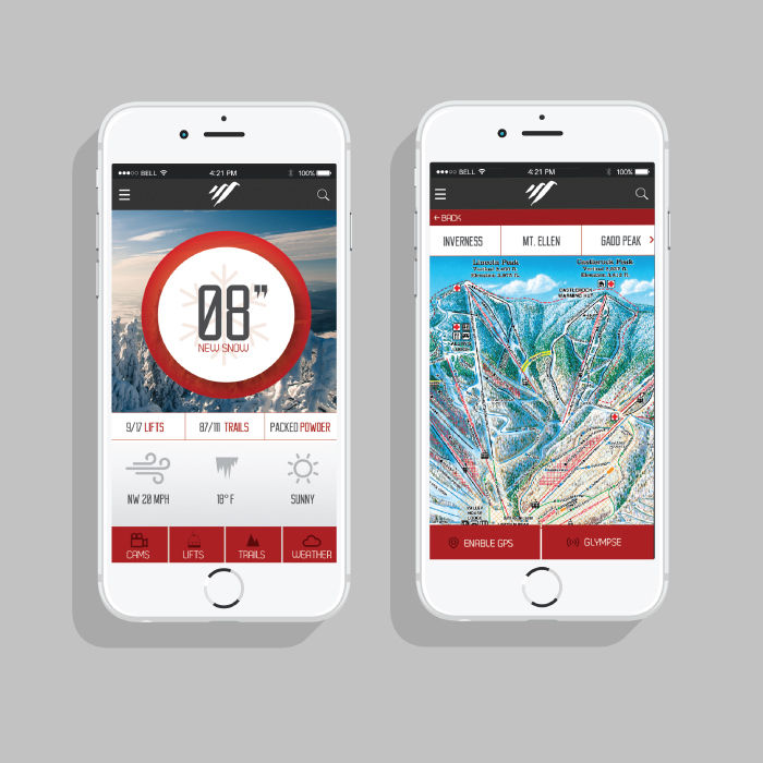
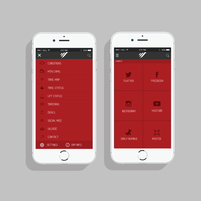
Pairing a fresh new look with effortless functionality. This application concept and design for Sugarbush Resort aimed to provide a modern new look with clear navigation and ease-of-use.
UX/UI | Design | Strategy
Pairing a fresh new look with effortless functionality. This application concept and design for Sugarbush Resort aimed to provide a modern new look with clear navigation and ease-of-use.


The user experience of this app was the most crucial aspect in my research and redesign for this project. After researching, interviewing, and creating personas, I felt I had sufficient information where I could formulate a good idea of how the features on the app should behave. By laying out each page and interaction with my information architecture and wireframes I was able to not only organize, but also make the flow of the app very efficient and easy to understand for any user.
My research enabled me to understand what my users desired in terms of which content they were reading, which features they utilized (and didn't), as well as understanding what visuals they found "eye-catching". By doing paper-prototyping with my users, I was able to further understand what features were confusing, beneficial, etc.
View Research & Process »Prototyping For Success
Not only was the research crucial in the redesign of this app, but so too was the interface design. I focused on designing the app to be not only functional, but pleasing to the eye as well. Tall sans-serif fonts with white space, pops of red, and the integration of icons and imagery helped give the app a fresh, fun, and energized look.
View the Prototype »