Design For Good
Branding | Website Design & Development
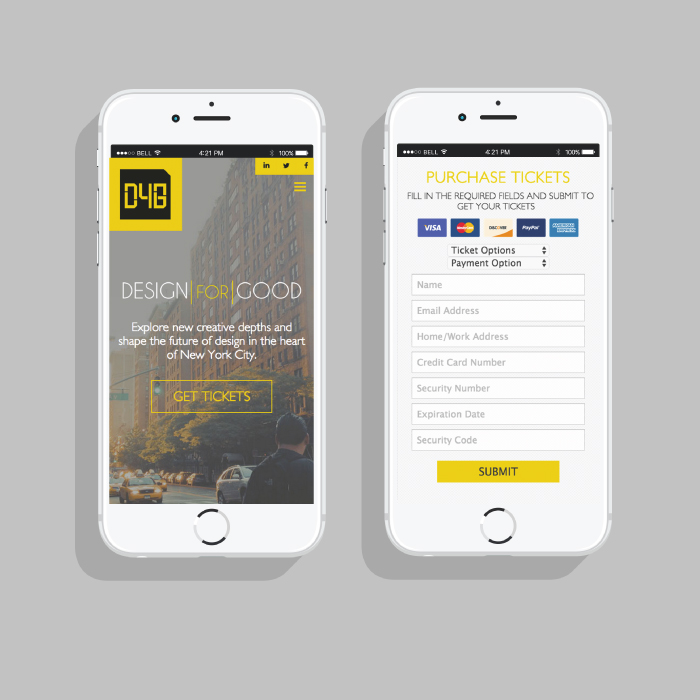
New branding and a responsive website to attract people to this design conference for designers from all industries
Branding | Website Design & Development
New branding and a responsive website to attract people to this design conference for designers from all industries


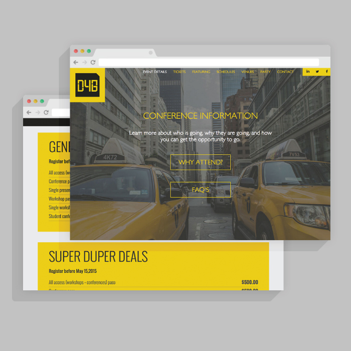
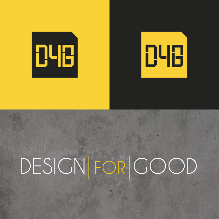
The core of the design was based around creating a "New York" feel by incorporating a color palette based off a typical taxi. Bold yellow accents and paired with various shades of grey, while also using textures found in the city like concrete and metal. Emphasis was also placed on the use of strong photography of the city in the background that entices the potential conference goer.
My research enabled me to understand what my users desired in terms of which content they were reading, which features they utilized (and didn't), as well as understanding what visuals they found "eye-catching". By doing paper-prototyping with my users, I was able to further understand what features were confusing, beneficial, etc.
View Research & Process »